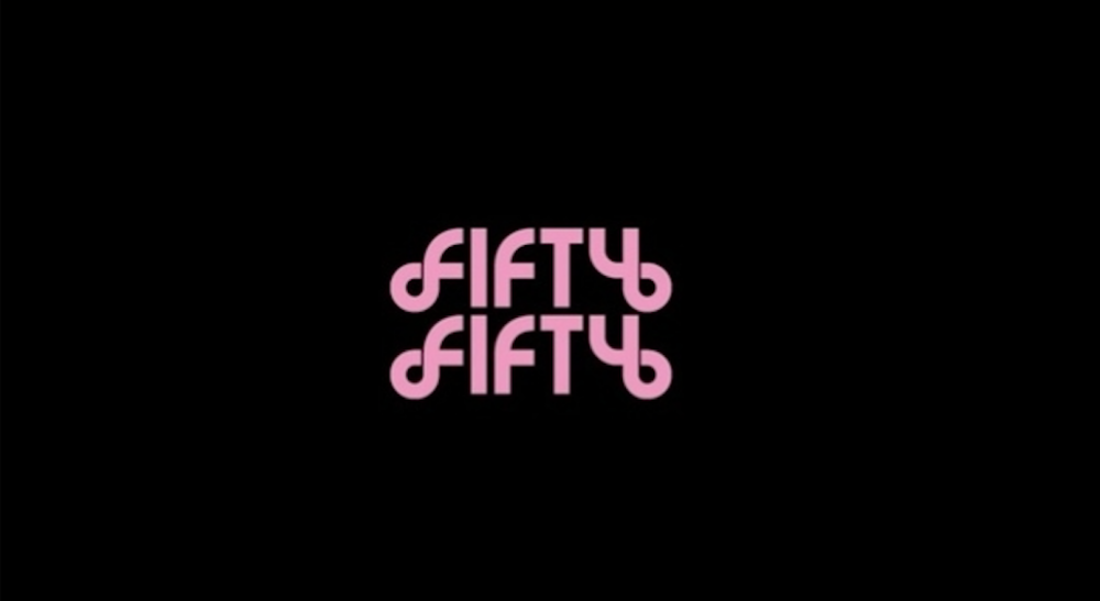
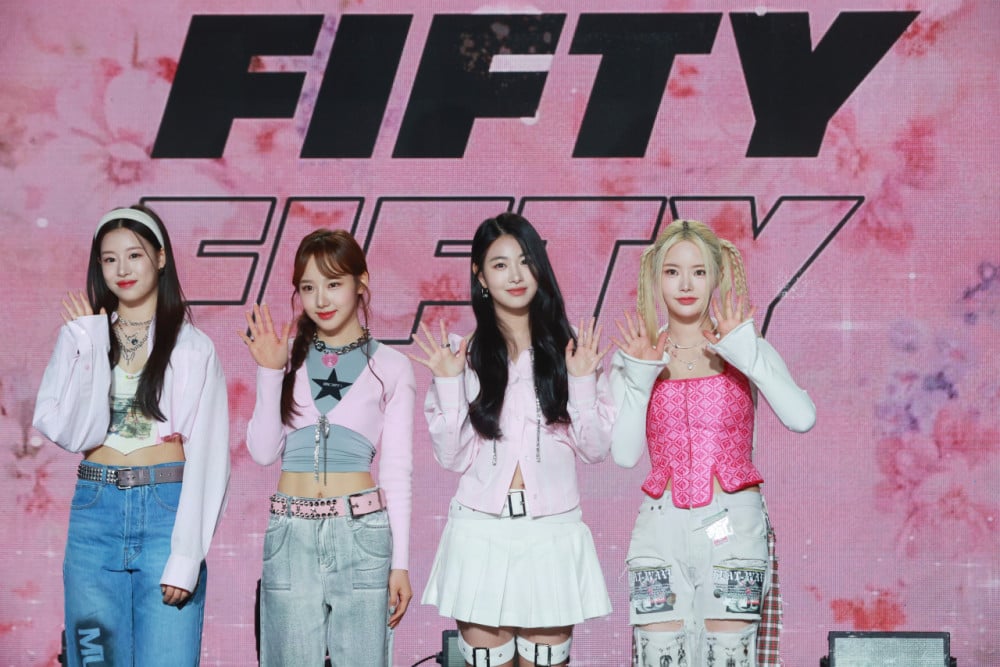
On August 5th, FIFTY FIFTY revealed a new logo motion through their official channels. In contrast to their previous black-and-white, bold, linear logo, the new design features striking geometric elements and a pink hue that gives a patterned effect.
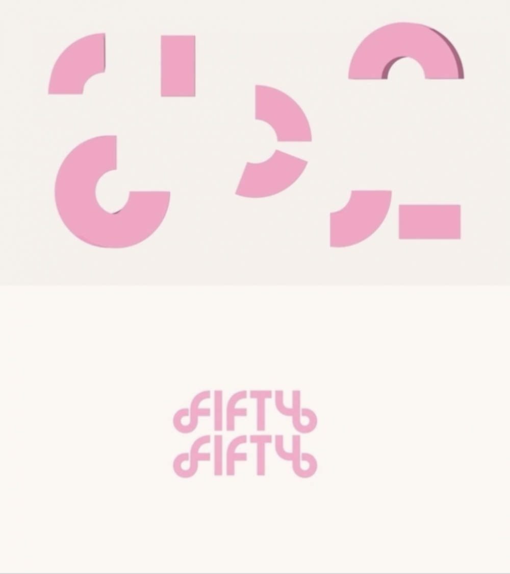
The logo begins as a single circular shape that transforms into various geometric forms, each spinning with its own unique style. After several rearrangements, the elements reconnect to form the name "FIFTY FIFTY," symbolizing the group’s rebirth as they come together again after a period of separation.
While the previous logo emphasized the literal meaning of "FIFTY FIFTY" through its black-and-white division, the new logo seems to focus more on expressing the group’s color and identity. This approach raises anticipation for the world that FIFTY FIFTY will newly express in their upcoming comeback.
Their agency, ATTRAKT, plans to release a series of content leading up to FIFTY FIFTY’s return, including silhouette video teasers and additional content that will heighten excitement for the group's full comeback.
 SHARE
SHARE


, Park Ji Hoon")


, Epik High, Tablo")


