
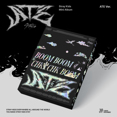
On our poll for the best 4th generation boy group logo, TXT is currently taking the lead, followed closely by Stray Kids. Earlier, users voted for BTS and BLACKPINK as the 3rd generation K-Pop groups with the best logos. It's time for you to decide which 4th generation girl group has the best logo.
aespa
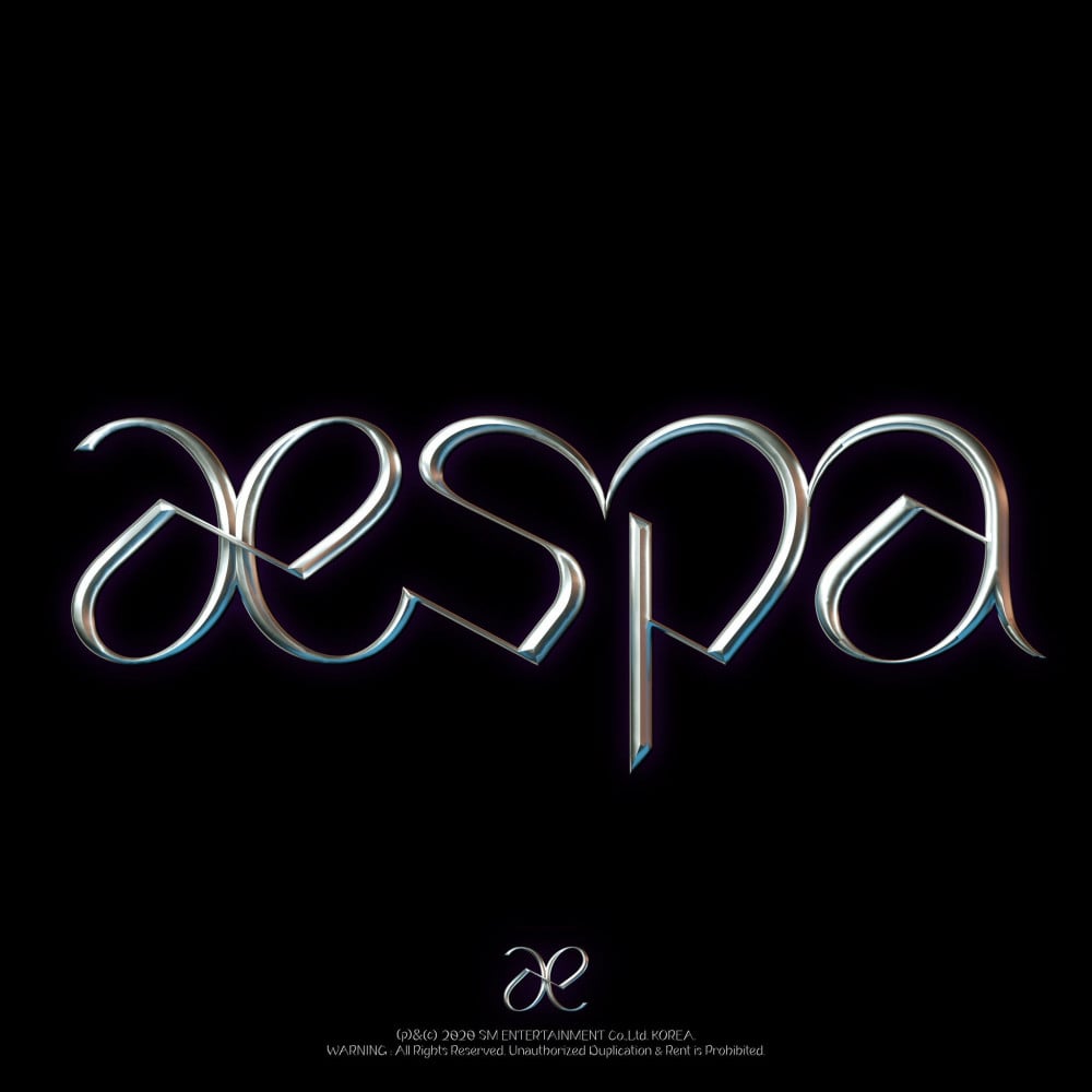
aespa's logo is sleek and extremely stylish. It has an intense effect that comes from the font. Without a doubt, it is the work of an expert graphic designer who has perfectly captured the essence of the group in the logo.
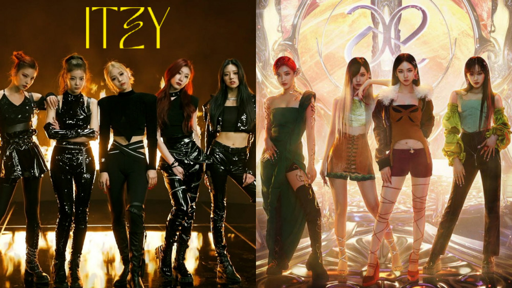
ITZY

ITZY's logo for their most recent comeback, 'Guess Who,' is significantly different from the original logo. However, it is equally, if not more attractive. The focus on the "Z" alone, draws attention but does not distract.
EVERGLOW
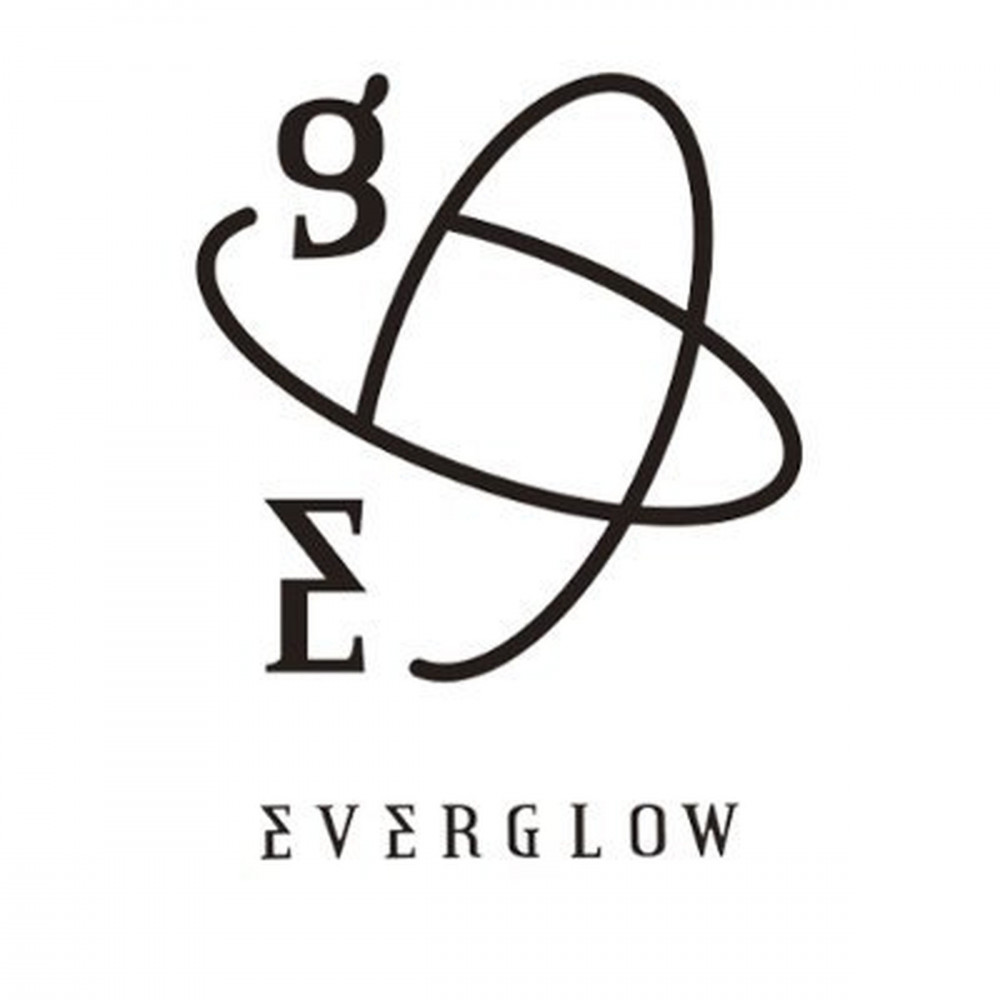
EVERGLOW's logo has evolved multiple times throughout the years. The most recent logo still retains the classic delta (g) and sigma (E) standing for EVERGLOW.
STAYC
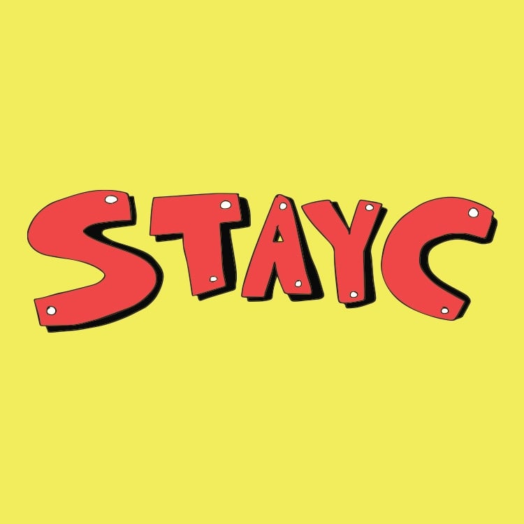
STAYC's logo has changed with each comeback depending on their concept, but it wouldn't be wrong to say that their logo, per se, is their name.
GWSN
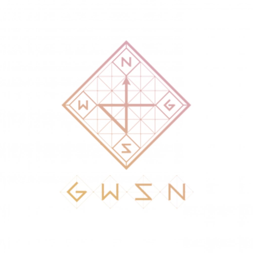
GWSN's logo represents a compass with 'G' standing for 'Ground' and 'WSN' standing for 'West South North.' It is lovely and mystical and definitely leaves an impression.
Weeekly
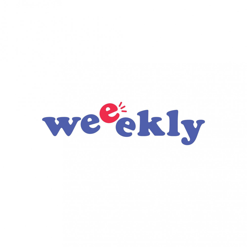
Weeekly's logo is adorable, to say the least, which fits their overall concept so far. A new fan would be able to tell right from their logo that their music is cheerful and energetic. That alone speaks volumes of the effectiveness of the logo.
Cherry Bullet
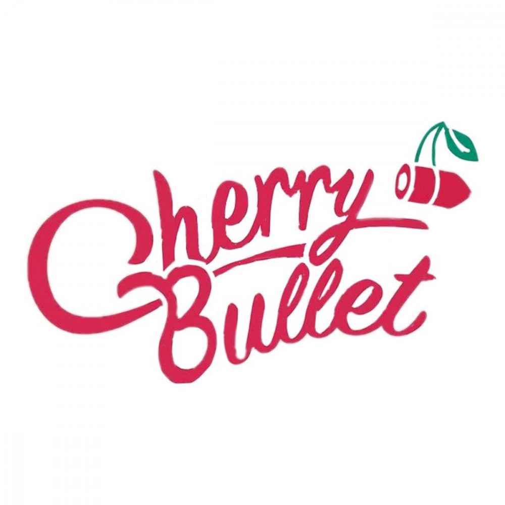
Cherry Bullet's logo has a brand power that is hard to miss. The red is striking and grabs attention, and the bullet-shaped cherry is a very literal and quirky graphic.
Who has the best logo? Vote in the poll below!
 SHARE
SHARE


")


, 2NE1, CL")


Everglow for me.It looks stylish and amazing...
3 more replies