
The users have declared, via polls on the best 3rd generation girl group logo and the best 3rd generation boy group logo that BLACKPINK and BTS have the best 3rd generation K-Pop logos. It is time for the 4th generation K-Pop fandom to let their opinions be known.
TXT

The TXT logo looks like the buttons on a joystick or a gaming controller. While the original design is retained, it is given different versions based on the relevant concept.
ENHYPEN

ENHYPEN's logo is very literal, but the font is not so simple. It is minimalistic, not plain. The importance of the hyphen is doubly represented through the chosen typeface.
TREASURE

TREASURE's logo features 12 shining stars or diamonds that represent the 12 members of the group. It is always heartening to see logos like these that signify strength in unity.

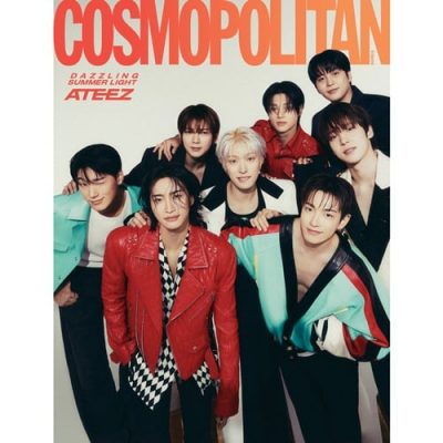
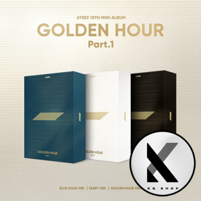
ATEEZ's logo has changed recently to what fans think denotes a horizontal hourglass. However, both the older version of the logo and the newer one are equally adored by ATINY.
STRAY KIDS

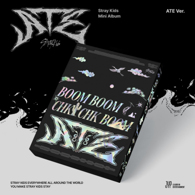
STRAY KIDS' logo has a punk-rock calligraphic style that perfectly encapsulates the essence of their aesthetic and concept. It is perfectly effortless yet intricately made, which is the ideal combination.
THE BOYZ

THE BOYZ's logo is simple, bold, and gets the message across efficiently. It is a combination of the letters "T," "B," and "Z," standing for "THE BOYZ." It is simple and leaves an impression, and, as such, is memorable.
Who has the best logo? Vote in the poll below!


 SHARE
SHARE





















I personally loved txt and treasure logos. There's some kind of deep meaning behind it...
1 more reply