
In a previous poll about the best 3rd generation K-Pop girl group logo, fans voted for their favorites and BLACKPINK received the most votes, followed closely by TWICE and Red Velvet. It's time for fans to decide what the best 3rd generation boy group logo is!
BTS

The BTS logo has become iconic over time as it signifies BTS and ARMY coming together as one. It is simple, bold, and effective but more importantly, it is meaningful.
EXO

The EXO logo is eclectic and very classy. It is unique and always leaves a lasting impression. While there are varied versions of it, the basic foundation of those designs is the hexagon logo. It was designed by none other than member Chanyeol.
GOT7

The classic original GOT7 logo with its unique font is near and dear to Ahgases' heart but many fans believe that GOT7's post-JYP era logo is also equally as great. Netizens have pointed out that the new logo seems to say "7 of 7" which is meaningful to fans and the group alike.
iKON

iKON's logo is the epitome of genius design. It is minimalistic and sleek and embodies the bold straightforward energy of iKON. This also has to be one of the coolest logo designs in K-Pop ever.
SEVENTEEN

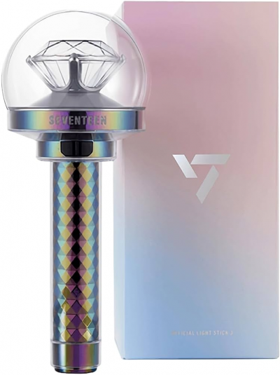
SEVENTEEN's logo is one for the intellectuals! It is designed to mean 1+1+1=1, referring to the three teams within SEVENTEEN that together form the group. Each part is indisposable and equally essential to bring the group together.
MONSTA X

Many fans think that the MONSTA X logo is made up of the graphic representations of the initials of the members of the group. Either way, it gives off a powerful vibe, much like the group's music itself.
VIXX

VIXX's logo looks a lot like a pentagram, which is not surprising considering that one of the most popular VIXX songs is 'Voodoo Doll'. It goes perfectly with the group's dark and mysterious concept.
Who has the best logo? Vote in the poll below!




 SHARE
SHARE


































Its exo, like best one of all times, they have managed morphed it for every single one of their concepts, and they are all diverse.